Signs should not have attitudes. They should also be grammatically correct.

This is a sign in the parking lot of a local Starbucks. It's a stupid sign.  

Signs should inform and instruct. They should not have an attitude, and this one has an attitude. 

See it?

After politely but sternly warning that "Continued use of these spaces will result in your car being towed," there is a pause, indicated by a dash, and then sign shouts at the reader:

" - at owners expense!!!"

Read it aloud. Begin with the polite but firm tone of most signs, followed by a pause, and then a melodramatic attempt to shock and awe the reader with surprise, anger, and volume.

- at owners expense!!! 

"Oh no! At the owner's expense? In that case, I'd better not park here. I was thinking about ignoring this stupid sign and leaving my car here even though I'm not a customer, but then that sign yelled at me. It sounded so forceful and authoritative. So now I've changed my mind. I'm moving my car right now and transforming myself into a law-abiding citizen. Thanks, sign!"

Stupid. 

Added to the stupidity of this attempt at attitude is (of course) the stupidity of the missing apostrophe in word "owners" and the added stupidity of three exclamation points. 

Volume does not increase in the reader's mind with each added exclamation point. Sentences do not change with additional marks of punctuation. One exclamation point is always enough. The use of three exclamation points indicates one of two things:

  1. You are under the age of 12.
  2. You are a moron.

In this case, I suspect the latter. 

It's hard to make so many mistakes over the course of three simple words, and yet this sign manages to do just that. Remarkably so.  

Among my many business ideas is an online service where you can send me the text of your planned sign so I can review and eliminate any grammatical mistakes or lack of clarity. Spare yourself the embarrassment of a sign like this with the simple click of a button.

Not only would it help businesses look more competent and professional, but it would make the world a better place.

But I suspect that the kind of person who makes this sign is the kind of person who doesn't know they need help.

Being a moron is one thing. Knowing you are a moron is quite another. 

The ineffectiveness of signage

A rule of signage that people don't seem to understand:

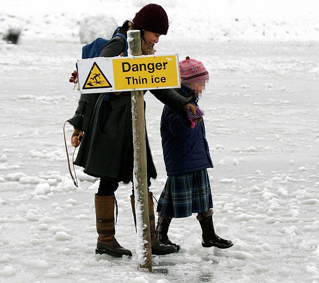
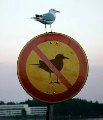
Signs only work on people who obey signs.

I worked with teachers this summer who wanted to hang signs on campus to enforce rules that they already had the power to enforce. Parents who were visiting the school weren't adhering to the limitations outlined during orientation, so the teachers wanted signs so they could point to something in the event they were required to act as an authority figure. 

As if a sign would abdicate them of any responsibility and therefore eliminate any potential confrontation. 

"Sorry, sir. You can't be in this building. It's not me. It's the sign."

"Apologies, ma'am. But did you see the sign? It says you can't be here."

I tried to explain that parents already understood the rules and were purposely violating them. The signs weren't telling these parents anything they didn't already know. Therefore, additional signage would not change behavior. 

Human intervention was required.

I know this because I am not a rule follower. If I see a rule as arbitrary or ridiculous or unfair, I often disobey the rule. I plow through signs quite often. For people like me, a sign is irrelevant if we do not agree to the rule stipulated on the sign. A sign is merely a suggestion about how the world should operate, but if that vision of the world strikes me as unnecessary, inefficient, arbitrary, or a hindrance to the way I think the world should operate, a sign is not going to stop me. 

The authority behind the sign may alter my behavior. The parking ticket or the air marshal or the social pressure applied by friends or colleagues may convince me to adhere to the rules, but a sign?

No.

When people are knowingly disobeying the rules, signs will rarely stop them, and they do not afford an ounce of backup or support to the person required to enforce them.

As a person who has accepted the responsibility of your position, you must enforce the rules. You must confront people like me and explain the expectation is and the potential consequences of failing to meet these expectations. I know that for some of these teachers, that would be hard. An annoyed, angry, or entitled parent is not pleasant. Confrontations aren't always fun. 

But when you accept the job, you accept the responsibility that comes with it. 

Signs won't do your job for you. Nor will they offer any support when you're dealing with someone like me. Decent people who are also rule breakers will often abdicate in the face of authority. If pressed on the issue, we will usually alter our behavior.  

But not always.

I was photographing the menu outside the cafeteria at Kripalu, hoping to send it to Elysha so she could tell me what to try (since I recognized nothing on the menu). As I was snapping my photo, a woman approached.

"I'm sorry," she said. "But this is a cellphone free floor."

I considered debating her on the subject. "Listen, if I had a camera in my hand right now, you'd have no complaint. So can we just pretend that this is just a camera for a moment? I'd like to take a photograph of your menu and send it to my wife so she can tell me what I might want to try, since I don't know recognize anything on your menu. I'm a heathen. A man child. Uncouth."

Instead, I asked, "Are you going to take my phone away if I keep using it?"

"No," the woman said, looking befuddled.

I smiled. "Then I'm going to keep using it for a minute or two."

Never tell a rule breaker that there is no consequence to breaking a rule.  

Management: Please stop signing your signs. It looks ridiculous and serves no useful purpose.

This sign was posted beside a plastic lion at Safari Golf, an excellent mini golf course near my home. 

The message itself is fine. Sadly, it's probably necessary to remind brain damaged teenagers not to sit on the pretend animals.

But here's the problem: 

What causes business owners to think that they need to sign their signage with phrases like The Management? To what purpose does this serve? Was it worth the additional expense (because it absolutely made the sign more expensive)?

Was management concerned that customers wouldn't take the sign seriously without an indication of where the message originated?

Did they worry that customers might think the sign had been placed there by someone other than management? A prankster, perhaps? Or maybe some strange offshoot of PETA that protects artificial animals?

Do they believe that the mention of management confers additional authority to the sign and therefore increases the chances of adherence.?

If any of this were true, then Stop and Yield signs would be signed by the federal government. Speed limit signs would feature the signatures of the local cops. Placards on airplanes would be signed by the pilot.  

Not every message needs to be signed. I barely sign my emails anymore. I agree to terms and service all the time simply by checking a button. 

We definitely don't need our signage to be signed. It doesn't make a sign more effective. It doesn't make it look more professional. It just makes the person who purchased the sign seem a little silly.